Brand iconography.
Brands are living things. Their identity is as much alive as the thing it represents. Building your place in the sea of others who might “do what you do” makes it one of the fundamental first steps anyone should take. This is why we’re profiling one of the most iconic brands of our time, starting with the simple swoosh we have come to love. This is Nike, and why their playbook could work for you too.
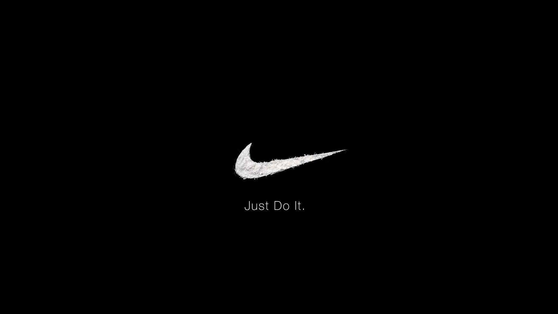
What does the swoosh mean?
The Swoosh is a sound that we hear when something zips past quickly by our side. This word stands for fast sound, speed, and motion. This is the reason that the custom logo is in a shape that shows an arch of movement.
Shapes and such.
The Nike symbol is one of the most simplified logo designs. Just a swoosh sign makes the logo a memorable business symbol. The company heavily depends on this symbol for its corporate identity.
Shape.
The Nike swoosh logo is shaped as a wing of the Greek goddess of Victory, Nike. So, the designer had the wing shape in mind because of the goddess. By borrowing the shape and other design elements from mythical, cultural, and historical sources, you can engage people with the design.
Color.
The Nike swoosh logo has been appearing in different colors. It appeared in strong black color for many years. Then, a dull orange shade was introduced as a brand color.
Font.
The Nike sign is a symbol. But the slogan ‘Just Do It’ was sometime added to the top side of the logo. The company name also features on the logo at times. The font used for the text looks elegant. The company name appears in bold letters as a means advertising the brand.
The font appears to be Futura Bold Condensed Oblique with minor tweaks. There is some slanting of the letter K to make the text distinctive and visible. Nike was written on the logo in Futura bold until 1995.